Krisna MacDonald
Krisna MacDonald
Banner_Browser_.jpg

Blu Dot: Digital

A new look for bludot.com.


Blu Dot: Digital

UX/UI Design / Art Direction

 
ResponsiveMockup_2.jpg


Bludot.com previously existed as separate desktop and mobile platforms. Our challenge was to create a new responsive interface to establish a consistent e-commerce experience across all platforms. As design lead, I was responsible for shaping the visual design system through concepting, execution and prototyping, while working closely with e-commerce specialists and developers. 

View the live site here.

Design Lead

Krisna MacDonald

Graphic Designer

Nikki Norberg


PREVIOUS BLUDOT.COM

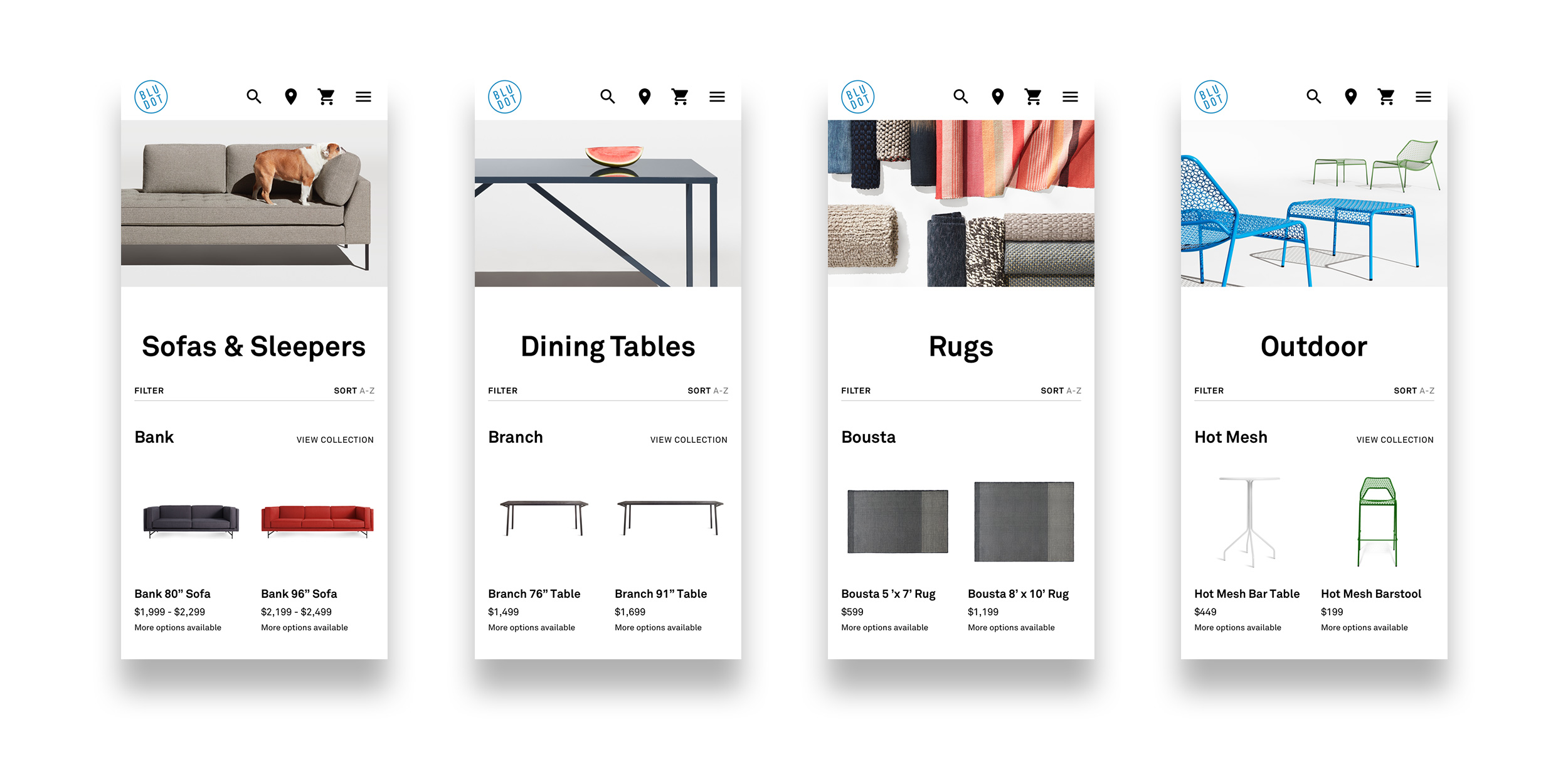
Looking at the desktop and mobile experiences, it was evident that there was a fractured and inconsistent digital experience along with some usability issues and opportunities to improve site maintenance efficiency. The site also lacked structure in terms of a grid and UI patterns, which made the entire experience confusing and ineffective.

 
Bludotcom_Previous.gif
 

Because the desktop and mobile sites both had their own CMS, it took twice the amount of effort to maintain and create content for the website. Also, the lack of a grid structure across the site lead to a lack of visual flow from page to page.


Bludotcom_Search.jpg

Unfamiliar placement of elements created confusion, such as the e-mail sign-up form frequently mistaken as a search bar.

 
Bludotcom_Logos.jpg

Brand inconsistencies, such as different logos used between desktop and mobile experiences.

 
Bludotcom_ADA.jpg

Many ADA compliance issues, such as low-contrast color combinations and unreadable type.

Bludotcom_Images.jpg

Lack of standards for selecting imagery created visual discord throughout the site.

 
Bludotcom_store.jpg

Unusual image crops lead to ineffective use of imagery.


FRAMEWORK

I began first with creating a system of grids for each breakpoint to create structure and to allow for quick wireframing for our executive leadership.

 
BD_Grids.jpg
 
BD_Wireframes_2.jpg


Homepage

The homepage features a modular interface of full-screen tiles that provides Blu Dot the flexibility to re-arrange and highlight content in a way that they weren't capable of before. 


Product Listing Pages

Through user-testing we discovered that users found our product listing pages crammed and difficult to navigate. Products are now broken up by furniture collections so it is easier to see where one style ends and another begins. The increase in white space also makes the pages more scannable and digestible. Reducing the number of products in each row and increasing the size of the thumbnails also allow for users to easily distinguish one furniture piece from another. 

 
PLP_5.jpg
PLP_Mobile_4.jpg


Photo Style

Consistent photography was key for a uniform e-commerce experience. Products were shot at low angles to emphasize the form and to maintain a graphic appearance online.

 
BD_Digital_PhotoStyle


Purchase Funnel

Pages within the purchase funnel are elegant while also utilitarian. Previous product detail pages were uninspiring and lacked Blu Dot's personality. The new experience shares the story behind some of the more iconic design pieces and leverages photography that are undeniably Blu Dot.

 
PurchaseFunnel_2.jpg
 

Throughout the design process, we made sure to maintain strong content parity so that all information is equally accessible regardless of what device a user may be using.


Brand Love

Engaging and content-rich pages articulate Blu Dot's value proposition and unique point of view in the furniture space. Included are Blu Dot's design process, history and list outlining what makes Blu Dot different from other furniture retailers.


AboutPages_3.jpg
 
BD_Digital_TypeStyles


visual Style

Blu Dot's slogan is "Modern, for the real world." Therefore, it was very important that the site be accessible to users who live in the real world. The visual language is high contrast for a modern look that also makes bludot.com accessible to users with disabilities. We utilized a simple type scheme and minimal color palette to elevate and enhance the experience on a site that now feels distinctly Blu Dot.


Assets_7.jpg